
Resources
Landing page optimization: a practical enquiry checklist
Landing page optimization checklist for service businesses: review offer clarity, proof, mobile usability and forms before planning a redesign.
By Krish Mandaliya · Updated 14 October 2026
Landing page optimization starts with a clear service promise, relevant evidence and a usable enquiry journey—not just a new design.
When a landing page receives visits but few useful enquiries, review the traffic and the page together. A clear page helps visitors decide whether your service is relevant and what to do next. It cannot make an unsuitable offer or audience suitable by design alone.
Start with the promise that brought someone to the page. Explain the service, give enough genuine context to evaluate it, make the enquiry process usable and check that requests reach the right person. This guide helps consultants, property businesses and other service businesses review those decisions without relying on invented conversion benchmarks or a universal page formula.
On this page
1. Landing page optimization starts with a clear page job
A landing page should support a clear decision. Is the visitor deciding whether to ask about an ongoing service, discuss a website project or request information about a property? Write that decision down before choosing the layout. It affects the headline, supporting information and main action.
Describe where visitors are expected to arrive from. A specific advertisement, a referral link and a general search can create different expectations. The page needs to meet the expectations you intend to serve. If one destination is trying to answer several unrelated promises, consider whether the message has become too broad.
Give the page one primary purpose while allowing people to investigate the business. “One purpose” does not mean hiding all context. It means being able to explain which decision the page helps someone make and why each section belongs there.
2. Match the headline to the offer
The headline should help a visitor recognise what is available and whether it might suit them. A clever phrase can add character, but it should not be the only explanation of the service. Pair a distinctive headline with clear supporting language when necessary.
Review the advertisement or link beside the page. Does it describe the same service, audience and next step? If an advertisement invites a scope discussion, the landing page should not imply an instant purchase or guaranteed acceptance. If it promotes a specific property, a generic list of unrelated projects may create confusion.
Read the first screen aloud as if you knew nothing about the business. Identify terms that require explanation. Keep words that help the person decide, and question words included only because they sound impressive. The aim is recognition and understanding, not a longer slogan.
3. Explain the scope before the visitor has to ask
People often need basic scope information before they can judge an offer. Explain what the service addresses, who it is suitable for and which important boundaries apply. You do not need to publish every project detail, but visitors should understand the kind of work they are asking about.
For a consultant, clarify whether the engagement is ongoing management, a defined project or a setup and handover. For a property business, distinguish general interest from a viewing request and avoid implying availability that has not been confirmed. Use factual information that the business can maintain.
If fees depend on scope, explain that a conversation is needed rather than inventing a fixed package. A useful page can be specific about the process without promising an outcome or price that has not been agreed. Clarity at this stage helps both the visitor and the follow-up team.
4. Give the information a useful reading order
A practical order begins with the offer and intended next step, then provides the scope, relevant context, process and evidence. Adapt that order to the question the visitor needs answered first. There is no single sequence that fits every service and buying situation.
Separate essential information from supporting detail. On a phone, a short opening explanation and a visible main action can make the page easier to scan. Longer descriptions can sit in clearly labelled sections or accessible expandable panels. Do not make text too small simply to reduce page height.
Look for repeated sections saying essentially the same thing. If three paragraphs each claim that the service is “tailored,” replace repetition with a concrete explanation of how scope is discussed. Every section should answer a question, clarify a decision or support a relevant next step.
5. Use genuine evidence and identity
Show the business or individual accurately. A real name, appropriate contact information and a clear description of the service give visitors useful context. Where credentials are relevant, state their actual scope. Avoid implying partnerships, authorisations or results that the available evidence does not establish.
If client outcomes are unavailable, a clearly labelled demonstration can still show how you think and work. Explain what was designed, what was tested and what remains hypothetical. A prototype is valuable as an example; it should not be presented as a successful live campaign.
Review visual evidence with the same care as written claims. A polished dashboard image can imply measured results even when it is only decorative. Use illustrations that support the idea, or label an actual screenshot accurately. Trust information should help a visitor evaluate the offer rather than disguise uncertainty.
6. Make the main action understandable
Use a button label that describes the next step. “Discuss your project” is different from “Buy now,” and the destination should reflect that difference. Supporting copy should explain whether the visitor will complete a form, choose a time or begin a conversation.
Keep the action available where it is useful, without filling every section with competing prompts. A visitor may want to read the scope before acting. Another may already understand the offer. Arrange the page so both can find the appropriate next step.
Review actions beyond the main button. Telephone links, email links and navigation should reach their intended destinations. Decide which options your team can support reliably. Multiple contact routes are not automatically helpful when one is unattended or when the page never explains which route suits the enquiry.
7. Review form labels and qualification questions
List every field and explain why it is needed. Contact information supports a reply. A service choice or short problem description can support preparation. Other questions should justify the effort they ask from the visitor. Avoid collecting detailed information without a practical purpose.
Form labels should identify controls clearly, and required fields should be understandable. Placeholders can provide examples, but should not be the only way to understand a field after typing begins. The W3C offers guidance on associating labels with form controls. W3C guidance on form labels.
Keep qualification and usability in balance. A shorter form may be easier to complete, but removing essential context can make the follow-up less useful. Test whether the questions support a suitable conversation rather than judging the form only by the number of submissions.
8. Test the complete process on a real phone
Open the live page on a phone and follow the actual route to the form. Check that text is readable, controls are distinguishable and the keyboard does not make required information difficult to reach. Use portrait orientation and review any horizontal scrolling.
Test invalid input as well as a successful submission. Can you identify the field needing attention? Does a hidden section open when an error is inside it? Is the success message clear about what happens next? Carry out any test submission using authorised details so the receiving team recognises it.
A browser viewport is useful for layout checks, but does not answer every question about a real device. Record which phones and browsers were tested. If a particular device has not been checked, keep that limitation visible in the review rather than assuming all phones behave identically.
9. Check loading and visual stability
A visitor needs the page to become usable without unexpected shifts disrupting the task. Review large images, fonts, embedded media and third-party scripts when the page feels slow or unstable. Focus on what the visitor experiences rather than treating a single test score as the whole diagnosis.
Web Vitals includes measures related to loading, responsiveness and visual stability. These can help organise a performance review, but they do not explain every enquiry problem or prove that a design change caused a business result. Google's Web Vitals overview.
Preserve useful visuals while checking their purpose and weight. A decorative animation should not block the offer or the form. Provide readable content when motion is reduced. If an image demonstrates work, use a suitable size and accurate description instead of uploading an oversized file by default.
10. Verify delivery and measure the right action
Treat successful submission, saved request, notification delivery and advertising measurement as separate checks. A visible success message does not by itself confirm that the intended recipient received the enquiry. Review the backend and communication process through an authorised test.
Agree which action will be reported as a meaningful enquiry. If a measurement records a button click, label it accordingly rather than interpreting it as a completed request. Keep the site's actual privacy and consent choices intact when reviewing what can be measured.
Use enquiry outcomes to ask better questions about the page. Are visitors requesting the service described? Are essential details missing? Does the receiving person understand what to do next? A page review becomes more useful when it connects the design decision to the actual enquiry process.
11. Use a clear example without inventing results
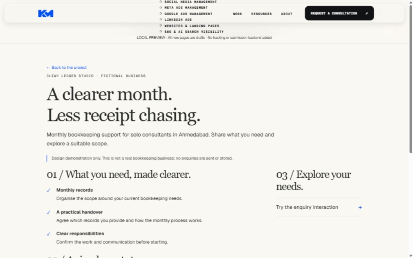
Consider the fictional Clear Ledger Studio landing-page demonstration. The audience is solo consultants asking about monthly bookkeeping support. Its headline introduces the situation, the page describes a possible scope and the enquiry step explains that a discussion is needed.
The design can demonstrate how to organise an offer and make the next step understandable. It cannot establish that this wording produces more customers. No live campaign traffic or conversion outcome is available for the fictional business. Those questions would need suitable evidence from an actual launch and review.
When evaluating your own page, make the same distinction between a decision and a result. You can explain why a section was changed without claiming an improvement before it has been measured. Explore the landing-page design demonstration for context, then assess your own situation.
12. Prioritise changes instead of rebuilding everything
Start with problems that interrupt understanding or action. A broken destination, an unclear service promise or a form that does not deliver requests deserves attention before small decorative preferences. Then identify improvements that could make the decision easier.
Keep a short change record with the issue, proposed adjustment and reason. When possible, avoid making many unrelated changes in one review. If outcomes later differ, acknowledge other influences such as traffic, offer changes and follow-up. Do not assume the page edit alone caused the difference.
A focused review should leave you with a manageable next step. Sometimes that is fixing delivery. Sometimes it is clarifying scope or reorganising the first screen. The useful question is not whether the page looks fashionable, but whether it supports the visitor's decision and your business process.
Frequently asked questions
Should I remove every navigation link?
Not automatically. Some visitors need to investigate the business, service scope or relevant work before enquiring. Keep helpful routes available and reduce links that create unrelated decisions. Assess the page's purpose and audience rather than treating navigation removal as a universal rule.
Does a landing page need to be very short?
It needs to be easy to understand. A short page can omit information needed for a serious decision; a long page can bury the action under repetition. Put the essential answer early and make supporting detail easy to navigate. Length should serve the question.
What if the page is clear but enquiries remain low?
Review traffic relevance, the offer, practical demand, measurement and follow-up. A page is one part of the journey. Without examining those parts, more design changes can become guesswork. Bring the destination and campaign context to a website and landing-page consultation.
A useful next step
Review your page with this checklist, mark uncertain items and choose one priority to verify. For help connecting the service message, page and enquiry process, discuss your project. The first conversation should establish the problem and suitable scope before promising a redesign or result.
This planning guide uses sourced guidance and explicitly labelled fictional examples. It does not claim client outcomes or guarantee results.
Discuss your project ↗